Call it a stretch, but
there
might be something to the idea that a team changing its uniforms,
colors, or
name can also change its fortunes. The Denver Broncos didn’t win a
Super Bowl
until they switched to ultra-modern uniforms in 1997. The Tampa Bay
Rays had
never even sniffed the playoffs until they dropped the “Devil” from
their name,
altered their look, and made it to the World Series. So maybe it
shouldn’t have
been a big surprise when the Atlanta Hawks redefined their colors and
redesigned
their uniforms in 2007 and made the playoffs two straight years after a
decade of
sitting at home. I really like the navy and red combo (which is surprisingly
little-used in the NBA) and the side striping is definitely
college-esque,
but not
overkill in my opinion. The red jerseys were an obvious step as
alternates and
the final result fits in somewhat with my personal belief that
alternate
jerseys should be a change of pace without being outlandish or ugly.
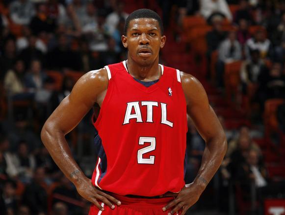
While the
Hawks’ red uniforms use the same template as the home and road sets,
the “ATL”
wordmark (also found on the home shorts) is a distinctive touch that brings
up
an
interesting topic we have yet to address at JOTW: city abbreviations on
uniforms.
The city abbreviation
is a rather
new occurrence on professional sports uniforms, but there are a few
instances
which leads me to believe that this is a style that we will see more of
in the
coming years. A quick definition for our purposes: the use of letters
not
solely at the beginning of a city name to abbreviate and identify the
city. For
example, “ATL” for Atlanta as in the feature photo. So by this
definition, the
use of initials for a multi-word city name like Kansas City with “KC”,
such as
on the Royals' hats or the Chiefs' helmets would not count. (Note: There
are
probably
a ton of examples of the city/school abbreviation in college sports
throughout
the years, such as Pennsylvania and Pittsburgh, so let’s just consider professional
teams for
this column). The first instance of the city abbreviation on a pro
uniform
appears to be the Phoenix Suns who plastered a “PHX” wordmark on the
team’s
home shorts as a faux belt buckle when they introduced new
uniforms
for the
2000-2001 season. The Suns later debuted an orange alternate jersey with “PHX” across the
chest in the
2003-2004 season. The Phoenix Coyotes ownership must have liked the
move as the
team added a new secondary logo that featured “PHX” within the
Arizona state
outline and used it as a shoulder patch when they unveiled new uniforms
for
the 2003-2004
season. The Atlanta Hawks alternates were introduced at the beginning
of this
season and just a few months later the Florida Panthers unveiled a third uniform set that featured a new sun and city abbreviation logo on the helmets,
shoulders,
and pants.
There are a couple of
offshoots
of this phenomenon that reside in the gray area between city
abbreviation
(“ATL”) and city initials (“KC”). One such case is that of a multi-word
city
name where one of the words is abbreviated. The St. Louis Cardinals
fall into this
category with their stylized
“STL” hat logo (no doubt, a classic) and the
Oklahoma City NBA franchise qualify for the lifeless “OKC” logo that adorns their shorts (but could easily be replaced with this). (I know I said no colleges, but it must
be
noted
that the University of Virginia checked into this group for two seasons
in the
early 1980s with these football helmets. I love the V-Sabre, but you’ve
got to
admit that those are pretty sweet as well). Another offshoot that I’m
not sure
whether to include is the case where a logo includes the first
letter(s) of the
city name and the first letter of the team nickname. It’s certainly a
step
beyond the “KC” city initial example since it includes the nickname
initial and
it does not appear that many teams have done it through the years. The
most
prominent example on a jersey is probably the New York Rangers’ Lady Liberty alternates from 1996-2007 (with one
year
featured in white). I really like that jersey, as it
accomplishes the changeup
criterion of an alternate while also including one of the city’s
strongest symbols.
Another example in this category is the New York Knicks "NYK" subway token logo which has appeared on
the back of the jersey above the player’s name since
2002.
Obviously, it’s going to take a much larger uniform overhaul to help
the
Knicks.
Photo Courtesy of Yahoo! Sports