Powder Blue Revival
April 29, 2010
| Kevin
Zdancewicz
We’ve talked about the topic of powder blue
baseball
uniforms before in this column as one of the few instances of a team
replacing the
standard gray jerseys and pants on the road. Eleven MLB teams used
powder blue
road uniforms for varying lengths of time mostly in the 1970’s and
80’s. The
Royals were one of those teams, rocking the powder blues for nineteen
years and
becoming one of the last two teams to drop it after the 1991 season (The other was the Montreal Expos). They were also one of the teams
that made it look good. I think this has to do with
the
royal
blue hats that played really well off the lighter shade of blue of the
jerseys
and pants. Last season, Kansas City introduced a powder blue alternate
jersey
(without matching pants) as a throwback-inspired tribute to their
classic look.
I really liked this as well, especially the way the white numbers and player names pop off the front
and back
of the jersey and the overall look with royal blue socks showing.
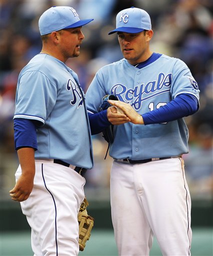
But the Royals have taken it to another
level with the new powder
blue hat for 2010 to go with the alternate jersey and shown in the
feature
photo. As far as I can tell, this is the first instance of a powder
blue base
color (crown or bill) for an official MLB hat. When I first saw it on its own, I actually said out loud, “That’s a
sweet hat.”
While I still think it looks great independent of the rest of the
uniform, when
paired with the powder blue jersey, it’s a bit too much in my opinion.
I think
the Royals would be better off sticking with their regular royal blue hat with the powder blue
jersey
as they
did last year (and still do on offense since the team just uses its regular helmets with the alternates). The
problem
is I
don’t know that there’s another uniform combination that Kansas City
has that
the powder blue hat would work with either. Maybe the royal blue jersey, but there aren’t any powder
blue elements
on it to tie the two together. It seems that this solid hat just
doesn’t have a
place in the Royals uniform set right now.
Now, if you follow MLB uniforms closely, you
may recall that
the Tampa Bay Rays had light blue bills on their batting practice hats in 2009. You could argue
that this is
actually the first case of a powder blue base color on an MLB hat, but
I would
disagree because the Rays hats are technically light blue and I don’t
consider BP
hats as
official game hats. Regardless, one of the Rays’ two BP hats this year
takes it
up a notch with a light blue crown and bill combination. The
emergence of
light blue (which has been used as an accent on their game hat since their redesign in 2008) for Tampa
Bay is
most evident in a light blue alternate jersey new for 2010. I
think
this one
looks solid and that the darker navy works a little better with light
blue than
the Kansas City alternate combo of royal and powder.
The topic of powder or light blue jerseys in
baseball
wouldn’t be complete without mentioning the Toronto Blue Jays who wear
a powder blue throwback to their 1979 season for
Friday home
games. (Toronto was also the first team to have a powder or light blue accent in their hat logo, though not for the entire crown or
bill). The
throwbacks were introduced last season and get props for a
nearly-complete look
(especially the hats), but lose points because of the fact that no one
wears
their pants up with late-70’s-era stirrups. A true throwback should
replicate even
the sock stylings of the time, but with players wearing “pajama pants”
that
drape over their cleats and being unwilling to change even on rare
occasions,
the overall look feels incomplete.
The fact that three teams wear powder or
light blue jerseys
after an absence of sixteen years could indicate a developing trend,
similar to
the black revolution across sports in the last fifteen or so years.
While it
might seem difficult for most teams to integrate powder blue into their
uniforms, it didn’t stop some from trying in the past. It might just mean more teams
wearing
powder
blue throwbacks for a single game, which – as long as they try to
imitate the
entire feel of the original – would be cool to see.
Photo Courtesy of ESPN.com
|