Indiana State of Mind
February 25,
2010 | Kevin
Zdancewicz
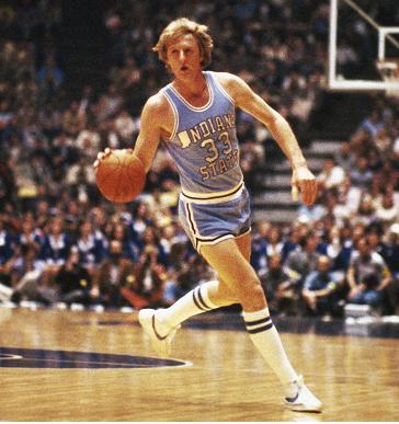
About a month
ago, Indiana State
wore throwbacks to the Larry Bird era. I’m pretty
sure
I had
seen those jerseys prior to last January, but at the time I must not
have
thought much of the most obvious aspect of the jersey – the use of the
Indiana
state outline as the letter “I” in the wordmark. That’s amazing in
retrospect
since it’s such a unique design element that really jumps out at you (and is so ripe for a
JOTW
column topic).
While the sheer number of sports, leagues, and teams – past and present
– make
it difficult to say anything definitive about sports uniform absolutes,
this
very well may be the only instance of a state outline as a letter. I’ve
never
seen it anywhere else and certainly not in the most popular and
well-covered
sports in this country.
Whenever a new
uniform design is unveiled,
I’m always interested to see if it has some element I’ve never seen
before. But
when you really think about it, a truly unique new uniform element is
incredibly rare. To see a real sports uniform first, it’s a lot easier
to go
back in time rather than forward. Going back to Terry Haute, IN circa
1979
yields the incredibly rare case of using the shape of a state as a
letter on a jersey. Granted, Indiana State was no
stranger to bizarre
uniform decisions, such as pairing plain jerseys with pinstriped shorts. But as I
said, I
can’t think of any other example of the state-outline-as-letter style,
which
was even immortalized on a Bird starting lineup figure (how sweet is
that?!).
Indiana
State still uses the state outline as part of its logo,
though sadly it no longer forms the letter “I” on their jerseys.
While the use
of a state outline on
a jersey is rare, its appearance in other areas of sports aesthetics is
more
widespread. Without leaving college basketball, one major example is
the use of
the state outline as part of the midcourt logo design. Some of the most
storied
college hoops programs employ this design, including North Carolina and Indiana (here’s an older version), for which it has become iconic.
I
think the
state outline midcourt design is a really cool look, especially when it
isn’t
comically large (see the Texas schools below). The Big Twelve is a
breeding
ground for midcourt state outlines with three current schools sporting
the
design. Missouri used to have a simple outline, but recently has obscured it
with
the
school’s tiger logo. In-state rivals Texas and Texas A&M (sublimated) have dueling state
outline court
designs, true to the notion that everything is bigger in Texas. The
only other
borderline current example I came across (bearing in mind that there
are over
340 teams in Division I and I probably missed some) was Michigan State,
which
has two state outline logos on the court but not at midcourt
That rounds out
the list of
current state outline court designs (to the best of my knowledge), but
it is
not the complete compilation of historic examples as a number of
schools used
to have the design but don’t anymore. Tennessee is a recent convert, while Kansas replaced its state outline-flag combination design with a gigantic
jayhawk when Bill Self took over in 2003. Ohio
State and Oregon are other examples. One interesting case
is
Kentucky, which appears to have taken its 1977-78
team photo on a court with a midcourt state outline. However, those photos
feature a
brick wall in the background which probably indicates that it was taken
at a
practice facility – though it’s certainly possible that the practice
court
design mimicked the actual court design at Rupp Arena.* Without
conclusive
photographic evidence, it remains a mystery.
In addition to
their appearances
on college basketball courts, state outlines have also been part of
logos for a
number of professional sports franchises with at least one example from
each of
the four major U.S. leagues. In the MLB, the Minnesota Twins shake hands in front of the
state
outline,
while the Texas Rangers used to have a couple of different
state outline logos. In the NHL, state outlines appear on the
secondary
logos of three teams – the Tampa Bay Lightning (old logo too), the Phoenix
Coyotes, and the Dallas
Stars – though interestingly, none of them have an
actual state in their name. (The New York Islanders’ logo does not
technically
qualify, but is worth mentioning because of the outline of Long Island in it). In the NBA, the
Golden State
Warriors used to have a very cool logo with the outline of California along the left side.
Finally, in the
NFL, the Dallas Texans (who later became the Kansas City Chiefs) had a
couple
of logos with the outline of Texas, including a very nice helmet
design. And
speaking of the Chiefs, they probably take the cake in state outline
history by
taking it up a notch and including the entire Midwest!
(Update: The
University of Kentucky added new uniforms in the middle of the season
which featured a small blue state outline under the collar and
above the player name on the Wildcats' jerseys.)
(Update 2: I've
come across a number of state outline examples in different sports
since this column. It seems that state outlines have a major presence
on college football helmets historically, including Indiana State's current and former helmets, Virginia Tech's old
helmets, Kentucky's former
helmets, and Utah State's old
helmets. The Wilmington Blue Rocks (minor league baseball) also
have a logo that includes state
outline.
Finally, it appears that Oregon has included a shoutout to the state
outline court design on the
concourse of their new arena.)
* Thanks to
Ivan Reifman of
the
excellent Basketball
Court Designs blog for pointing this out to me and for providing
assistance
in coming up with some state outline examples.
Photo
Courtesy of Politico.com
Jersey of the Week Archive
|