Covering
sports uniforms is a lot
more dynamic than one might think. I have written over 40 JOTW columns
and I
always seem to stumble upon updates or things I missed regarding the
uniforms I
have highlighted in them. In order to keep you completely informed on
these
topics, I’ve compiled a list of updates for previous columns. The
switch from
Fanatic to Wahoo Wire didn’t preserve the JOTW
archives,
but
they are available on another site so I’ve linked to the column being
addressed
there followed by the update or other pertinent information. The
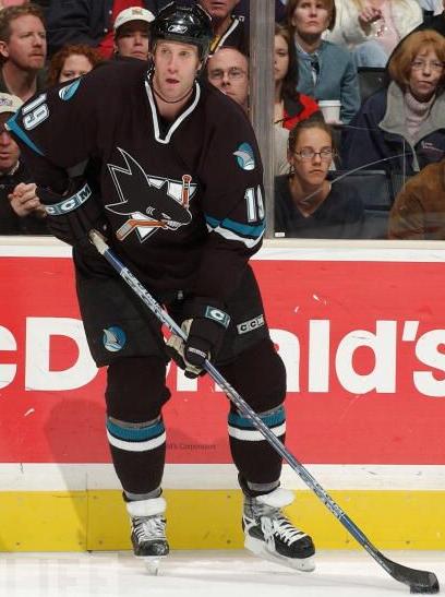
featured photo
depicts the San Jose Sharks’ third jersey set circa 2001-2007. It’s
always been
one of my favorite uniforms with the solid shark logo, awesome dorsal
fin
secondary mark on the shoulders and pants, and the way the teal and
white pop
off the solid black base. Enjoy the updates!
JOTW:
The
Best
Players, Not the Best Uniforms
In this
column, I talked about how
the Pro Bowl uniform designs always look ridiculous because of
seemingly
ultra-modern aspirations that result in offbeat jersey templates. Well,
the 2009
versions for the AFC and NFC were no different. I’m not a fan of the two-tone, bib look, and it’s interesting to note
the star patterns
integrated into the jersey fabric.
JOTW:
Purple
Raptor’s Majesty
I
mentioned in this column that I
liked how the raptor on the original Toronto jerseys had a unique “R” jersey that the team doesn’t actually wear,
similar to
how the dolphin in Miami’s football logo has an “M” helmet that doesn’t really exist. Well
someone
designed
new logos for all of the NFL teams with animal mascots modeled after
the
Dolphins’ logo. Very cool!
JOTW:
Update Edition
Yes, even
the first update column
has updates. In that article, I mentioned that while looking for
documentation
of NFL teams that wore blue pants for JOTW: A
Blip for
the Blue and Silver, I found out that the Denver Broncos wore orange
pants
for a year. I’ve finally come across a photo of the orange pants in game action.
JOTW:
A Pink
Memorial
After
highlighting the pink jerseys
being worn at NC State and other women’s college basketball teams, our
own
Virginia Cavaliers wore pink
uniforms and shoes to promote breast cancer awareness.
JOTW:
College
Retro Stripes
This year,
both Alabama and DePaul switched to uniforms without retro
stripes
(thanks
to UniWatch
for
those comparison photos), but Penn State picked up some of the slack with a
modern take
on the style. The Nittany Lions actually wore those uni’s last season
as well,
but I was unaware and did not include them in that column. Also,
college retro
stripes are spreading to the gridiron where the Temple
football team used a variation on their pants, possibly as a
throwback to these uniforms from an undetermined year. I’m
not
sure they
translate quite so well to the football field.
JOTW:
Red and
Black (Not White) All Over
I
neglected to mention the
Philadelphia Phillies in this column as a team that once wore dark
pants in the
major leagues. The Phils rocked an all-maroon look in 1974. One team I did
reference
was the
Oakland Athletics, but I only linked to mannequin illustrations of
their
colorful uniforms throughout the 1970s. Here’s a more realistic
depiction of
their gold jerseys with gold pants.
JOTW: Oregon
Featherweights
If you’re
wondering what crazy
combinations the Oregon football team wore this season, look no farther
than the Ducktracker.
You can click on each illustration to see an action shot from each game.
JOTW:
Going Gray
I am sure to come across a number of other gray college
basketball uniforms, but this is the first since my Seattle U article:
the University of South Carolina-Upstate.
Photo Courtesy of Life.com