Wahoowa
June 1, 2010
| Kevin
Zdancewicz
One of the first things I
ever did
on the Internet was go to virginiasports.com and print off page after
page of
information about UVA baseball. The site had news, game recaps, an
updated
schedule, and the team roster – all of which was difficult to keep up
with at
the time if you didn’t live in Charlottesville. The one frustrating
part was
that it was mostly text-based so there were very few pictures.
Therefore, even with
that significant increase in the availability of information, keeping
tabs on
the uniforms of various Virginia teams was limited to the rare times
games were
on TV (easier for football and basketball, but tougher for non-revenue
sports).
And the late-1990s was an interesting time in terms of the visual
identities of
UVA teams. Some used the now-omnipresent V-Sabre, originally introduced to the football
team’s
helmet in 1994, while others used the familiar block-V-with-Virginia
logo or some other V variation. Baseball had its own take on it
with
a block-V
hat logo that was used as recently as 2004, Brian O’Connor’s first
season
as coach. The following season and ever since, the team has used the
V-Sabre
logo on its hat in step with the entire athletic program’s more uniform
adoption of it.
While we’ve come a long way
from
those early years on the UVA athletics website and photos are more
prevalent,
it’s still tough to keep track of which uniforms the Hoos use for each
game
without being there. College baseball teams tend to have a ton of
uniform
combinations. The number of games played is significantly more than in
other
sports and most weekends include a series with three games on
consecutive days.
Having multiple uniform combinations helps break up the monotony of
wearing the
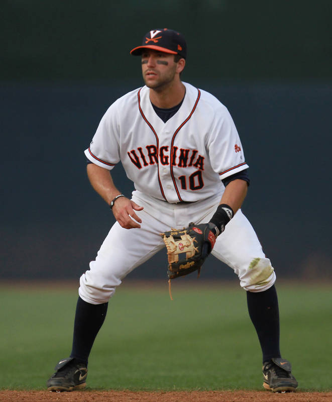
same thing for every game. Virginia appears to have used three major
combinations this season: the solid white look in the feature photo, a navy jersey with white pinstriped pants, and an orange jersey with solid white pants. Virginia
has
two
hats, both with the V-Sabre: solid navy worn with the navy jersey and
navy with
an orange brim worn with the orange jersey and the home whites. In
addition to
the two main hats, Virginia got a little festive earlier in the year
and wore green hats for its game on St. Patrick’s Day.
The
solid
white is a classic home look and I really like the “Virginia”
lettering, which
appears to have been inspired by my favorite MLB team. The navy and orange
jerseys
feature
an identical script “Virginia” (which I also like) across the chest and
one-stripe piping down the front placket and around the sleeves. For
the navy jersey this meshes fine with the pinstriped
pants, but
the one-stripe piping on the orange jersey clashes with the three-stripe piping of the solid white pants
(also
used for
the home white uniform). I think both uniforms would look better with
white
pants with a single navy stripe down the sides.
While they have worn these
three
uniforms predominantly this season, there have been a number of
additional
designs used during O’Connor’s tenure at UVA that may have appeared in
games
this year. One of the regular sets used last season and my favorite
recent
jersey is the solid navy version with “Virginia” in orange
with
white
trim. It features the Red Sox font again, which dresses up the solid
navy base enough
to make it clean without being plain. This jersey appears to have been
worn mostly
with pinstriped pants, but it looks like in this photo solid white pants were used on
occasion
or in
the past, which I greatly prefer.
Here’s a non-exhaustive
rundown of
other uniforms from within the last decade:
- Solid white jersey with a slightly different
“Virginia” wordmark and solid white pants with one-stripe navy piping.
- White pinstriped jersey with script “Cavaliers”
wordmark. I
was never a big fan of these pinstripes – they’re kind of bland and I
prefer to
see the school name to the team nickname on college uniforms – so I
wasn’t sad to
see that they weren’t used this season.
- Solid navy jersey with script “Cavaliers”
wordmark, solid white pants with one-stripe navy piping, and orange
hats, which I wasn’t a big fan of.
- Solid orange jersey with script “Cavaliers”
wordmark, solid
white pants with one-stripe navy piping, and orange socks, which are a
bit too
garish for my liking.
- Navy jersey with orange armpits and script
“Virginia”
wordmark (as on current navy and orange jerseys) with solid white pants
with
one-stripe navy piping. I wasn’t a big fan of the armpit design with
piping
down the sleeves, just seemed to be a bit much. I tend to prefer more
traditional baseball uniform styles.
- Navy jersey with orange armpits and script
“Cavaliers”
wordmark.
- Orange jersey with navy armpits and script
“Cavaliers”
wordmark (ditto on the orange socks).
- White hats with navy jerseys and solid white
pants.
- White vests with block “Virginia” lettering.
- White
vests with a different script “Virginia” wordmark with tail. This
look is
from around 2001 and, based on the few games I caught in the
late-1990s, this
“Virginia” script with the tail is a good indication of what the team
wore
around that time. Also, it’s kind of hard to see, but if you look
closely the
helmet logo features the V from the V-Sabre but without the sabres.
This logo
never appeared on the team’s hats, however.
After seeing all of those
different
uniform combinations, one thing you might have noticed is the lack of
gray
pants. Traditional baseball protocol calls for the home team to wear
white
uniforms and the road team to wear gray (though some use a
different
color).
While colored alternate jerseys are increasingly used in MLB games, one
team
always has white pants and the other has gray (or sand) – regardless of
whether
one or both teams are wearing colored jerseys. In the college game,
however, it
is not uncommon to have both teams wear white pants with one wearing
white
jerseys
and the other a colored one. While in lower leagues one might expect
teams to
have fewer uniform options and therefore resort to always wearing white
pants,
but it seems a little odd for a college team like UVA to have so many
different
jerseys without gray pants.
There are a number of other interesting
aspects of the UVA baseball visual identity. The baseball squad is one
of the
few that has yet to use a variation similar to this “Virginia” wordmark which has been adopted
by virtually every other University
team. I’m torn since I like the lettering and
script that
the baseball team has now, plus it distinguishes it from the school’s
other
sports, but I think the standard “Virginia” wordmark would also look
good on a
baseball jersey. Another interesting aspect is that Virginia appears to
use a navy helmet with orange brim no matter what the
rest of the
uniform or hat being used (recall that the team wears a solid navy hat
with the
navy jersey when looking at that photo). Finally, I really like the use
of the “Hoos”
wordmark on the back of the hats and on the left sleeve of the jersey.
Hopefully now you’ll know what to expect the
Hoos to wear as
they make their way back to Omaha. Wahoowa!
Photo Courtesy of Virginiasports.com
|